
Stacked Clustered Bar Chart
Stacked Clustered Bar Chart is combination of Stacked Bar Chart and Clustered Bar Chart
This chart provides quick insights into comparing multiple categories. These bar charts are a great way for displaying the contributions of parts of a whole effortlessly and depicting data values better and smarter, visually. For example, how much each categorical variable contributed to the revenue for a particular period. Stacked clustered charts allow you to comprehend data while being able to visually compare the total values in an effective way. You can even plot stacked clustered chart from Excel to Power BI.
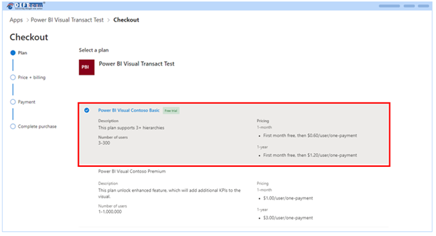
Purchase the visual from AppSource by completing the checkout process. Then, add licenses.
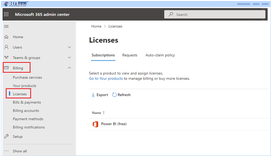
- To add or assign licenses to Stacked Clustered Chart: Go to admin.microsoft.com, choose Billing > License.
- Select a Visual you want to assign licenses.
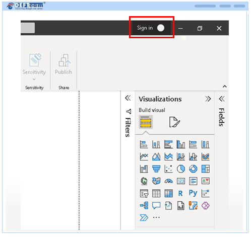
- Next, you will need to open Power BI Desktop application.
The minimum required version for Power BI desktop application to use Stacked Clustered chart should be July 2022 version or above.
- Open Power BI Desktop application.
- Sign in with your licensed email id.
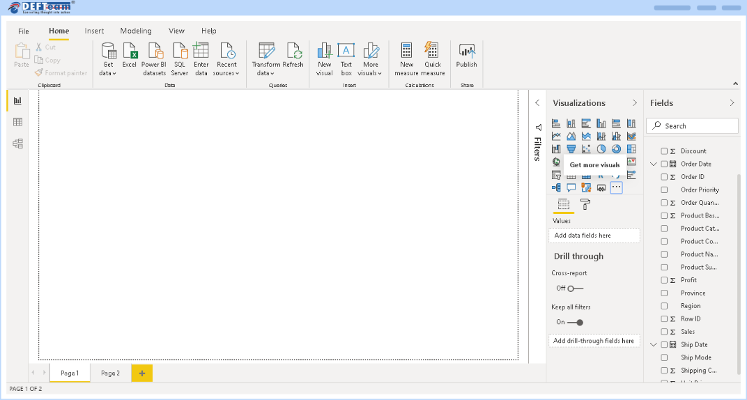
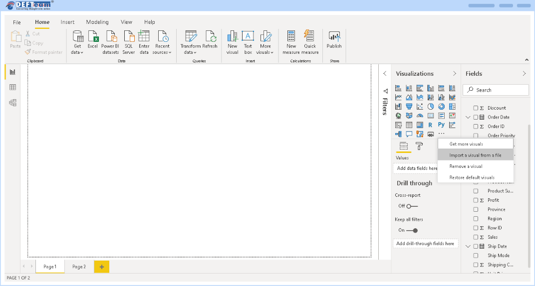
- Click on import custom visuals.
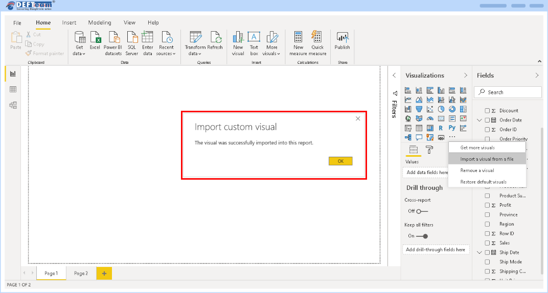
- Click Import a visual from a file, locate the pbiviz file, then click OK.
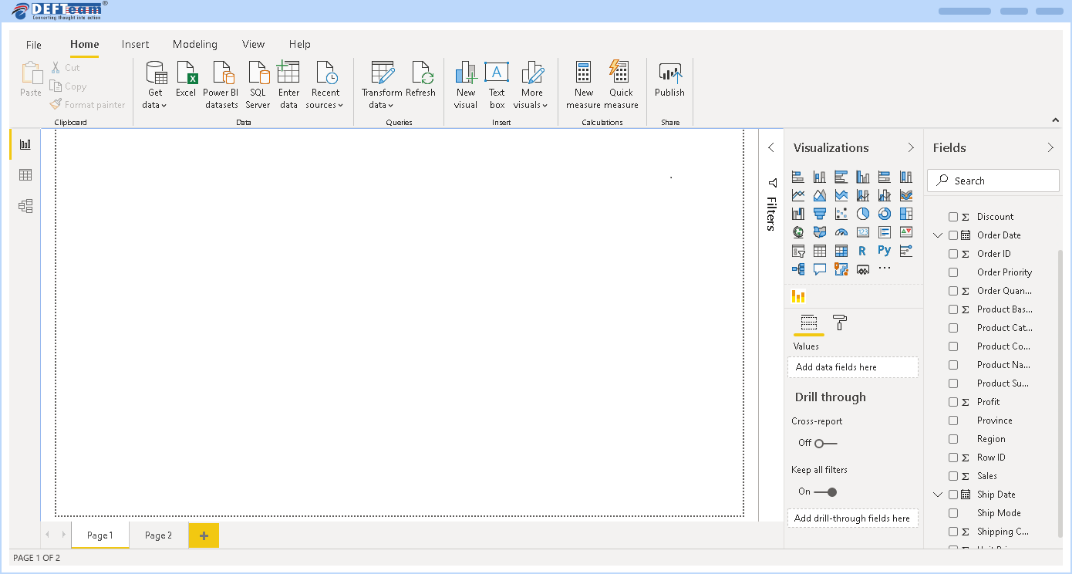
- After the import is complete, you will be able to see Clustered Stacked Bar Chart icon.
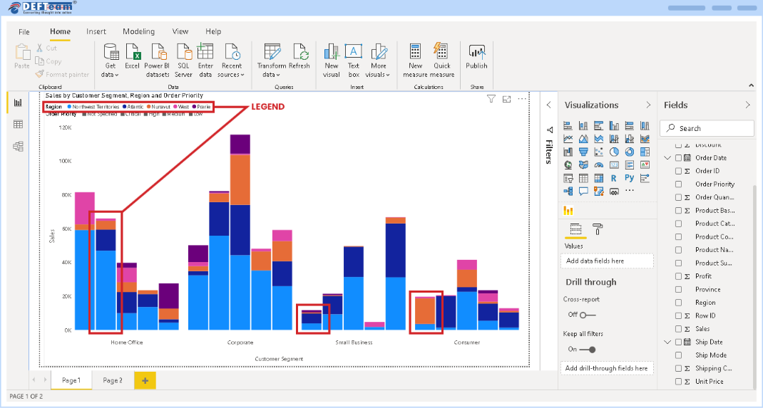
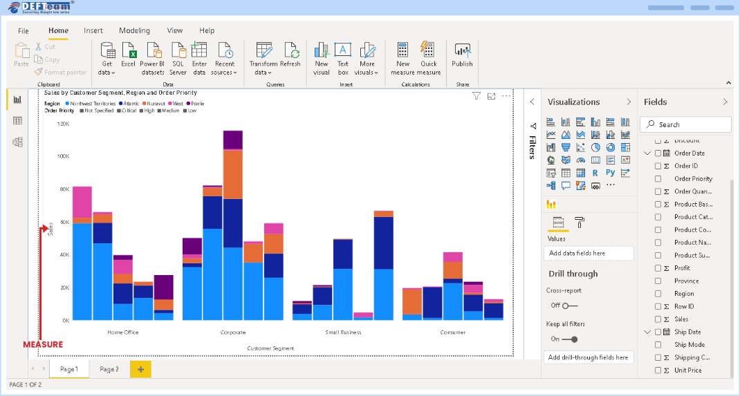
- Creation of Stacked Cluster Chart requires four fields – Category 1, Category 2, Legend and Measure.
- Category 1 as displayed below is used for creating Cluster.
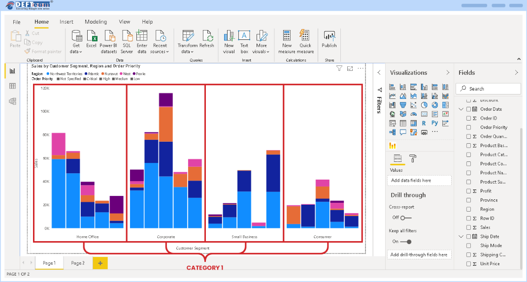
- Category 2 is used for creating side-by-side bars within a Cluster. The order of Category 2 variables are highlighted below.
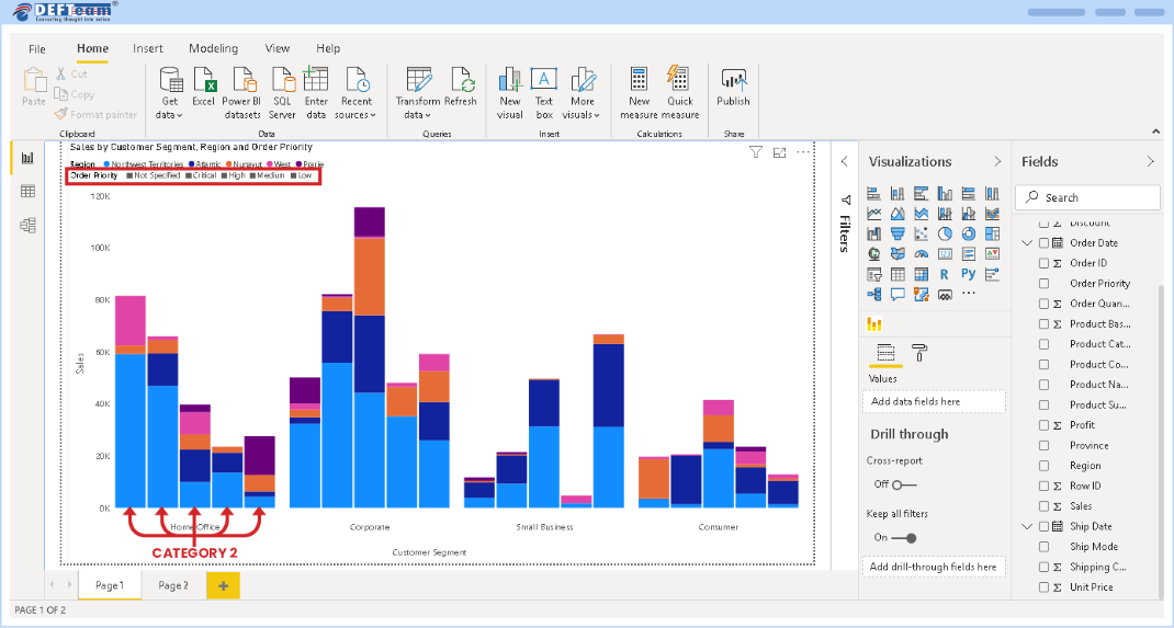
- Legend is used for creating a Stack within a bar of Category 1.
- Measure is used for plotting values on the Y-Axis.
Frequently Asked Questions
-
Once I assign a license, how long does it take until I can use it?
Once you have successfully assigned licenses in the Microsoft 365 Admin Center, it should be available within an hour.
- If you’re using the licensed visual in the Power BI Service, refresh the report by hitting F5.
- If you’re using the licensed visual in the Power BI Desktop, close and reopen it.
If, after you refresh, the license is still not available, wait a while and try again. It could take up to an hour.
-
Who can assign licenses after the purchase is complete?
If the tenant admin owns the licenses (Org licenses), then any of the license admins (Global Admin, License Admin or User Admin) can manage the licenses. However, if the subscription owner isn’t an admin, then only the purchaser can manage the subscription and licenses.
-
Can we use a visual without having to upload it to organization visual?
Yes. You can download a visual directly to your reports.
-
How do we get upgrades of the visuals?
The AppSource visuals are updated automatically when a new version is available.
-
How do I know if someone in my company has already purchased this same visual?
If you’re a company administrator, sign in to the Microsoft 365 admin center see all subscriptions and to whom they’re assigned.
If you aren’t an administrator, speak to the administrator in your company.
-
How do I get support?
If you need help, please visit our contact us page: https://www.defteam.com/contact-us/ or reach out to us at sales@defteam.com