Cluster Marker Map using Power BI
Facing difficulty in identifying markers of interest? Grouping of Markers in Power BI Cluster Marker Map based on proximity can help
How Power BI Cluster Marker Map works
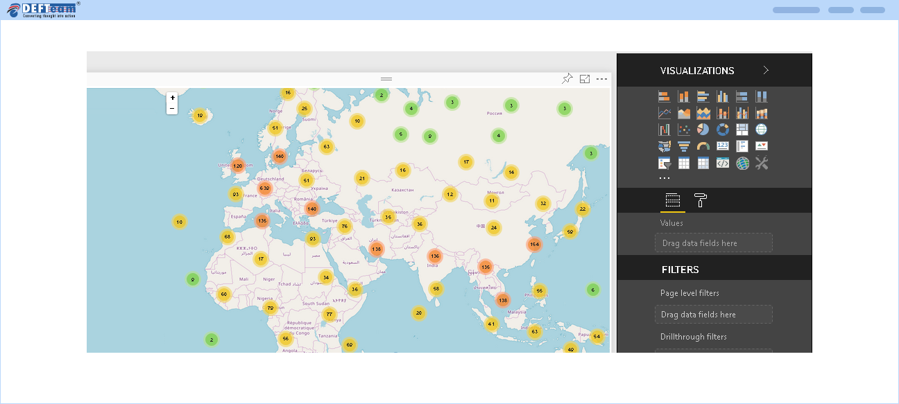
Once the Custom Visualization is imported in Power BI Cluster marker Map, end users can drag and drop the relevant fields to render the Power BI Cluster Marker Map with clusters. Each cluster is represented by a number, that determines the number of markers within that cluster. The End user can view the markers by clicking the cluster or by zooming the map.
Below screen represents the map with multiple clusters:
Below screen represents the markers in a cluster:
